



Businesses don’t just guess. They calculate. The theory of production is the framework firms use to answer two brutal questions: how much to make, and how much to spend to make it. It connects the price of your product directly to the wages of the workers and the cost of the raw materials. It’s not abstract. It’s about survival.
Decisions happen in three layers of complexity. The first is simple. You have a factory. You have equipment. You need to produce a specific number of units. How do you do it cheapest? This is short-run cost minimization. The second layer asks what quantity maximizes profit for that existing plant. The third, and hardest, is deciding the size of the plant itself. That is long-run profit maximization.
The Production Function Explained
Every firm wants to produce at the lowest possible cost. This assumes quality and factor prices are fixed. The tool for this is the production function.
It’s an equation. It maps input to output.
$$y = f(x_1, x_2, … x_n; k_1, k_2, … k_m)$$
Here, y is output. The x terms are variable inputs. These are things you can change quickly. Hourly labor. Raw materials. The k terms are fixed inputs. Machinery. Salaried staff. You can’t just fire your CEO or sell your factory building today.
The function tells you exactly what output results from any combination of these inputs. Note the direction. Inputs determine output. Output does not determine inputs.
This creates a problem. Many combinations of labor and materials can produce the same result. One mix might use lots of machines and few workers. Another might use mostly human hands. Finding the cheapest of these combinations is the core task.
Short-Run Cost Minimization
In the short run, you are stuck with your fixed capital. You can’t change the factory size. You can only adjust the variables.
The goal is simple: hit your target output y at the lowest total cost. Total cost is just the sum of payments to all factors. If labor costs $20 an hour and wire costs $5 a foot, you calculate the mix that gets you to production goals without burning cash.
This isn’t about maximizing profit yet. It’s about not wasting money. If you can produce 1,000 units for $10,000 instead of $12,000, you have a better shot at survival. The math of the production function guides this choice. It shows the trade-offs. More labor might mean less wire. Less wire might mean slower production. The firm finds the sweet spot.
The second layer moves up. Now that you know how to produce efficiently, how much should you actually make? This is where short-run profit maximization begins. But that’s a different problem. For now, the firm just needs to stop bleeding cash on inefficient methods.
“The entire formula expresses the amount of output that results when specified quantities of factors are employed. It must be noted that though the quantities of the factors determine the quantity of output, the reverse is not true.”
The cost equation is just the sum of these inputs. Cost = (Price of x * Quantity of x) + (Price of k * Quantity of k). Minimizing this sum subject to the production constraint is the mathematical heart of the first decision layer.
It’s rigid. It’s constrained. But it’s precise. The firm knows its limits. The question is only how to work within them.
When you look at the bottom line, you’re splitting expenses into two buckets. The first covers variable costs. These are the “direct” expenses in accounting terms. You can change them easily. The second bucket holds fixed costs. Accountants call these overhead. You can’t easily shrink them. We are starting with the variable side first.
The goal is simple. Find the cheapest mix of variable inputs. A gold chain factory illustrates this well. Let’s say there are only two moving parts. Labor (goldsmith-hours) and gold wire.
The production function looks like this:
y = f (x1, x2; k )
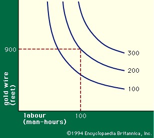
Here, k reminds us that fixed machinery matters. The output depends on x1 (feet of gold wire) and x2 (goldsmith-hours). You can map this out using an isoquant diagram.
mapping production efficiency
On the graph, plot goldsmith-hours on the horizontal axis. Put feet of wire on the vertical axis. The curved lines are isoquants. Each line represents a specific output level.
Take the 200-chain isoquant. One point shows 100 goldsmith-hours plus 900 feet of wire. Another point shows 130 hours using only 850 feet of wire. The workers are slower. They use more labor but save on material. Both points sit on the same curve. They produce the same 200 chains.
Infinite such lines could be drawn. The diagram just makes the production function visible.
why factor substitution matters
Isoquants show factor substitution in action. You can swap one input for another. Use more labor to save material. Use more wire to save labor. This flexibility is what allows managers to make decisions after setting the output target. If substitution were impossible, the choice would be made for you.
The shape of these curves is critical. Empirical data supports this standard curvature. As you add more of one factor, you need less of the other to keep output steady. But there is a catch. The less you can save on the second factor as you add more of the first.
This is diminishing marginal rates of substitution.
The marginal rate of substitution tells you how much of x1 you can cut when you add one unit of x2. Keep output constant. In our graph, it is the steepness of the isoquant. As you add more goldsmith-hours (x2 ), the curve flattens. It becomes harder to save gold by just working slower. Eventually, you hit a wall. This assumption drives the rest of the cost analysis.
aligning costs with technology
Now bring price into the picture. Variable cost is p1x1 + p2x2. Add this to the diagram.
You get straight lines called isocost lines. An isocost line shows every combination of inputs you can buy for a set variable cost v.
The formula is:
p1x1 + p2x2 = v
The slope of an isocost line is p2/p1. It depends only on the price ratio of the two factors. It does not care about your production technology. It only cares about the market rates.
Where the isoquant touches the lowest possible isocost line, you have your optimal mix. The slope of the isoquant equals the slope of the isocost line. The rate at which you can technically substitute inputs matches the rate at which the market allows you to trade prices.
Most firms operate well below this efficiency. They pay too much for labor when material is cheap. Or they hoard wire when labor is abundant. The math doesn’t lie. The trade-off is constant. The question is whether you can actually execute the swap.
To produce 200 units, you need to find the right balance between input costs and output.
Look at the isocost lines.
v 1 isn’t enough. The line never touches the 200-unit isoquant. You simply can’t produce that much with that little money.
v 3 is overkill.
v 2 is the sweet spot. It’s the lowest variable cost for which 200 units can be produced.
The coordinates where the v 2 isocost line touches the 200-unit isoquant tell you exactly how much of each factor to use. This assumes factor prices are in the ratio p 2/p 1.
Cheaper combinations for any quantity always appear where the relevant isoquant is tangent to an isocost line.
Key Insight: Firms trying to produce as cheaply as possible will always purchase or hire factors in quantities such that the marginal rate of substitution equals the ratio of their prices.
This tangency point solves the short-run cost minimization problem. It finds the least-cost combination of variable factors for a given output in a fixed plant.
We call this variable cost VC(y ).
Total short-run cost, SRC(y ), adds fixed costs to the mix.
SRC(y ) = VC(y ) + R(K )
R(K ) is the annual cost of fixed factors.
Marginal cost behavior
Two other numbers matter now.
Average variable cost, AVC(y ). It’s variable cost per unit.
AVC(y ) = VC(y )/y
Marginal cost, MC(y ). Roughly, it’s the increase in variable cost when you make one more unit.
MC(y ) = VC(y + 1) – VC(y )
You could treat VC as a continuous function for theory. But this discrete definition works fine here.
Figure 3 shows how these costs behave as output changes in a fixed plant.
Vertical axis: dollars per unit.
Horizontal axis: units per year.
At low output levels, average costs are high. Why? Not enough work to keep the workforce fully occupied.
People idle. They shift jobs expensively.
As output rises, average costs drop to a flat plateau.
Then capacity approaches.
Congestion sets in.
Average costs shoot up.
Overtime hits. Outmoded equipment runs. Inexperienced hands take the wheel.
Machinery doesn’t get routine maintenance. Minor breakdowns disrupt schedules because there’s no slack.
The AVC curve forms a flat-bottomed U-shape.
The MC curve falls faster. It rises more rapidly than AVC.
It’s steeper.
Does your current production volume sit on the flat part of that U, or are you climbing the congestion slope?
The difference between idle workers and overtime pay defines your margin.
Factor prices dictate the ratio. The tangency point dictates the quantity.
There’s no magic formula. Just math.
Finding the profit-maximizing output level
You have the cost curves. You have the product price, p 0. Now you need to decide how much to actually make.
This is where the math stops being abstract and starts telling you exactly what to do. Look at the marginal cost (MC) of producing one more unit. If that cost is lower than the price you can sell it for, you are leaving money on the table by not making it. Selling that extra unit adds more to revenue than it does to costs. Profit goes up.
Do the opposite if marginal cost exceeds price. Cut back. Every unit you produce beyond that point costs more than it brings in. You bleed profit.
So where is the sweet spot? It is the exact moment where marginal cost equals the market price.
MC(y) = p0
This is the rule. If the market offers a specific price, a rational firm produces the quantity where its marginal cost curve intersects that price line.
Visualizing the gain
Look at the graph. Price p 0 is a horizontal line. The MC curve cuts through it. The intersection point tells you the optimal output, y *.
At that output level, you also need to know your average variable cost (AVC). Let’s call that value a.
For each unit sold, you are making p 0 – a in net revenue above variable costs. Multiply that per-unit gain by the total output y *, and you get the total excess of revenue over variable costs. On a graph, this is the shaded rectangle. It represents the short-term cash flow available to cover fixed costs and generate profit.
The short-run supply curve
This logic does something powerful. It turns the marginal cost curve into a map.
If the market price is below the lowest point of the average variable cost curve, you shut down. You cut your losses. Producing nothing is the least bad option.
But for any price above that shutdown point, the quantity you produce is simply the value on the MC curve corresponding to that price.
Therefore, the marginal cost curve is the firm’s short-run supply curve.
It sounds simple. It is. The supply curve is just the MC curve, excluding the part where it sits below average variable costs.
Aggregating to the market
Take every firm in the industry. Take their individual supply curves. Add them up.
You get the market supply curve.
This curve is the other half of the story. Pair it with the market demand curve, and you have the mechanism that sets the equilibrium price and quantity for the entire commodity. It is the fundamental engine of price determination in competitive markets.
The hidden flaw in the model
There is a trap in this straightforward logic.
The derivation assumes that the prices of factors of production—labor, raw materials, energy—stay fixed. This is a fair assumption for a single firm acting alone. They are too small to move the market for steel or wages.
But what if all firms try to increase output at the same time because prices have risen?
They will all bid against each other for those inputs. Factor prices will go up.
When input costs rise, the marginal cost curves for every firm shift upward. The result is less output expansion than the static model predicts. The simple supply curve overstates how responsive production is to price increases.
To get a realistic picture, you need a more sophisticated model. One that accounts for induced changes in factor prices. Standard economic literature covers these adjusted curves, but the basic intuition remains: competitive expansion drives up input costs, which eventually curbs the supply response.
Businesses don’t just guess at what to pay workers or how much to charge for goods. There is a mechanical link between what a factor of production adds and what it costs. This link is the marginal product.
Define it simply. The marginal product of a factor is the extra output you get if you add one more unit of that factor. Everything else stays the same.
Mathematically, it’s the difference between output at $x_1$ units and output at $x_1 + 1$ units.
If $MP_1(x_1)$ is the marginal product of factor 1, then:
$$MP_1(x_1) = f(x_1 + 1, x_2, …, x_n; k) – f(x_1, x_2, …, x_n; k)$$
This number tells you how much output grows. It also ties directly to the marginal rate of substitution.
Think about trade-offs. If one more unit of factor 1 adds $f_1$ units of output, you need $1/f_1$ more of factor 1 to get one extra unit of output. Conversely, if factor 2 has a marginal product of $f_2$, cutting its use by $1/f_2$ reduces output by one unit.
So, swapping $1/f_1$ units of factor 1 for $1/f_2$ units of factor 2 keeps output roughly constant. The marginal rate of substitution between the two factors is the ratio $f_2/f_1$.
We already know that firms substitute factors until the rate equals the ratio of their prices. Therefore, factor prices must be proportional to their marginal products.
Factors Are Paid for What They Add
This is a core theorem in economics.
Factors of production are paid in proportion to their marginal products.
This isn’t about fairness. It’s about efficiency. Businessmen try to produce as cheaply as possible. They adjust inputs until the cost of an input matches the value it brings.
The math gets tighter when you bring in marginal costs and product prices.
If adding one unit of factor 1 increases output by $MP_1(x_1)$ and costs $p_1$, the marginal cost of that extra output is $p_1 / MP_1(x_1)$.
Do the same with factor 2. The marginal cost is $p_2 / MP_2(x_2)$.
These numbers are identical. It doesn’t matter which factor you tweak to expand output. The marginal cost remains $p_i / MP_i(x_i)$.
Firms choose their output level where marginal cost equals the market price of the product, $p_0$.
So:
$$p_0 = \frac{p_i}{MP_i(x_i)}$$
Rearrange that equation.
$$p_i = p_0 \times MP_i(x_i)$$
The price of each factor equals the product price multiplied by its marginal product. This is the value of the marginal product.
Why Equality Is Non-Negotiable
This result is fundamental to income distribution.
The logic is stark. If the equality is broken for any factor, profits can be increased.
Hire more of a factor if its value exceeds its cost. Lay off workers if their cost exceeds the value they create.
Businessmen will do this. They don’t have a choice if they want to survive. The market forces them to the equality point.
Two Conclusions for Short-Run Decisions
The theory of production in the short run leads to two strict rules for how firms respond to market prices.
- Firms produce the quantity of product where marginal cost equals the market price.
- Firms hire factors until the value of the marginal product equals the cost of the factor.
The first rule explains commodity supply curves. The second explains factor demand.
These conclusions started with a firm using two factors. They apply generally. No matter how complex the production process, the math holds.
Price signals dictate everything. The value of what you add determines what you get paid. The cost of what you buy determines what you sell.
There is no wiggle room.
Connecting Short-Term Tactics to Long-Term Strategy
You can’t really understand where a business is going by only looking at where it’s standing right now. The theory of profit maximization in the long run is built on short-run behavior, but it’s messier. Two things make it complex. First, long-run cost curves look different than short-run ones. Second, you can’t just add up what individual firms do to understand an entire industry. The list of who is in the market changes.
In the long run, adjustments happen by adding or removing fixed capacity. This means building new plants or shutting down old ones. It’s not just about tweaking a schedule.
How Plants Dictate Profit Potential
An established firm with a factory already built makes short-run decisions based on the current price of its product and the cost curves for that specific plant. If prices are high enough that the firm is operating on the rising part of its short-run cost curve, marginal costs are high. They exceed average costs. The firm is making operating profits. See Figure 3 in your textbook if you need a visual.
But then the firm asks a harder question. Can I increase profits by getting bigger?
Expanding the plant has a trade-off. It reduces the variable cost of producing high volumes of output because you aren’t straining limited facilities. But it increases fixed costs. You are paying more to stay still.
Firms will eventually acquire the fixed plant that minimizes short-run costs for any output level they expect to sustain. This leads to the long-run cost curve. The long-run cost of producing any unit of output is simply the lowest possible short-run cost for producing that unit in the best possible plant. It’s a balancing act. You weigh the fixed costs of the plant against the short-run production costs within it.
We denote long-run total cost as LRC(y). The average long-run cost is LAC(y), which is LRC(y) divided by y. The marginal long-run cost is the increase in cost for one extra unit of output. It combines short-run and long-run adjustments. When a firm uses the cost-minimizing plant, long-run marginal cost equals the previously defined marginal cost.
The Shape of Industry Costs
Long-run cost curves aren’t a single shape. They fall into three broad classes. Which one applies depends on the industry.
In constant-cost industries, average cost stays roughly the same at all output levels, except at the very lowest. This happens in manufacturing where capacity is expanded by copying existing facilities without changing the technique. Think of a cotton mill adding more spindles. The process is the same; the scale just grows.
Then there are decreasing-cost industries. Average cost drops as output grows, at least until the plant is large enough to dominate a significant share of the market. Heavy, automated machinery drives this. It’s economical for large volumes. Automobile and steel manufacturing are prime examples.
But decreasing costs are unstable in competitive markets. If costs drop as you get bigger, a few large firms can drive all smaller competitors out of business. It creates an unnatural advantage.
Finally, increasing-cost industries see average costs rise with output volume. This usually happens because the firm cannot obtain additional fixed capacity that is as efficient as the plant it already has. Agriculture and extractive industries are the most important examples here. Resources get scarcer or more expensive as you push harder.
Why The Theory Gets Pushed Back
The theory of production has taken a lot of heat. One major objection is that the production function isn’t derived from observation. Even the most sophisticated firms don’t actually know the direct functional relationship between raw inputs and ultimate outputs. It’s an abstraction.
You can get around this by using linear programming. It employs observable data without needing to assume a specific production function. The conclusions end up being practically the same.
Critics also charge the theory with excessive simplification. It assumes the rest of the economy stays static while firms adjust. It neglects changes in production techniques. It ignores the risks and uncertainties that cloud every business decision. These criticisms hit the long-run profit maximization model hardest.
On another level, critics argue that businessmen don’t always care about maximizing profits or minimizing costs. Human behavior is rarely that clean.
The Reality of Economic Theorems
All these criticisms have merit. But the simplified theory of production still indicates basic forces and tendencies operating in the economy. You shouldn’t view these theorems as conditions that are always and instantly achieved. They are conditions the economy tends toward.
It is rare for them to be attained exactly. But it is just as rare for substantial violations of the theorems to endure. Markets correct themselves, slowly.
The explanation above only covered the simplest aspects. The theory could be extended to firms that produce more than one product. Almost all firms do. It could also be applied to firms whose decisions affect the prices they sell and buy at, covering monopoly, monopolistic competition, and monopsony. That’s harder, but possible.
The behavior of firms in oligopolies is where things get controversial. These are firms that recognize the possibility that competitors may retaliate. It remains a theory subject to ongoing research and debate. The lines between perfect competition and chaos are thinner than the textbooks suggest.
Where to dig deeper into cost theory
If you want to move past the basics and actually understand the mechanics of production costs, you need to look at the heavy hitters. This isn’t about quick tips. It is about the structural underpinnings of business economics.
William J. Baumol’s Economic Theory and Operations Analysis (4th edition, 1977) offers a solid, intermediate-level breakdown. It bridges the gap between abstract math and real-world operational constraints. If you are trying to figure out how long-run costs influence investment decisions, this book is a primary stop. Vernon L. Smith’s Investment and Production (1961) goes further. Smith explicitly links investment behavior to long-run cost structures. He argues that you cannot separate the two.
For those who prefer technical precision, Paul A. Samuelson’s Foundations of Economic Analysis (enlarged edition, 1983) is the gold standard. It is dense. It is rigorous. But it clarifies the mathematical logic behind supply and demand curves better than almost any other text.
Then there is George J. Stigler. His Production and Distribution Theories (originally 1941, reissued 1994) traces the evolution of these ideas. It shows how our understanding of production shifted from simple observations to complex models. You can see why certain cost curves behave the way they do by reading Stigler’s historical context.
But if you only read one paper, make it J. Viner’s “Cost Curves and Supply Curves.” Published in Zeitschrift für Nationalökonomie (3:23–46, 1931), it remains a classic for a reason. Viner distinguishes between short-run and long-run costs in a way that still holds up today. He explains which costs are fixed and which are variable in a manner that feels less like algebra and more like business strategy.
These texts are not easy. They require patience. But they provide the framework for making better financial decisions because they strip away the noise. They focus on the core relationships between capital, production, and time.
The market changes. The tools do not.
“Cost curves and supply curves are not just lines on a graph. They are the reflection of managerial choice and technological constraint.”
You might wonder if these old theories still apply to modern tech startups with near-zero marginal costs. The principles of fixed versus variable costs remain relevant, even if the scale has shifted. The logic holds. The application just looks different.
There is no shortcut to understanding these dynamics. You have to do the reading. You have to do the work.


